 If you've been paying attention to In The Pink(ies) you will notice that there have been a few design tweaks going on across all the sites. The new Pink Insider twitter page gave us the opportunity to make things a little more consistent across the main blog and the YouTube and Vimeo channels. If you visit on a daily basis, you will see the tweaks happening live. Some of these are very minor, while others are quite radical, but overall, if you are only seeing the end product it is hard to see how the design evolves.
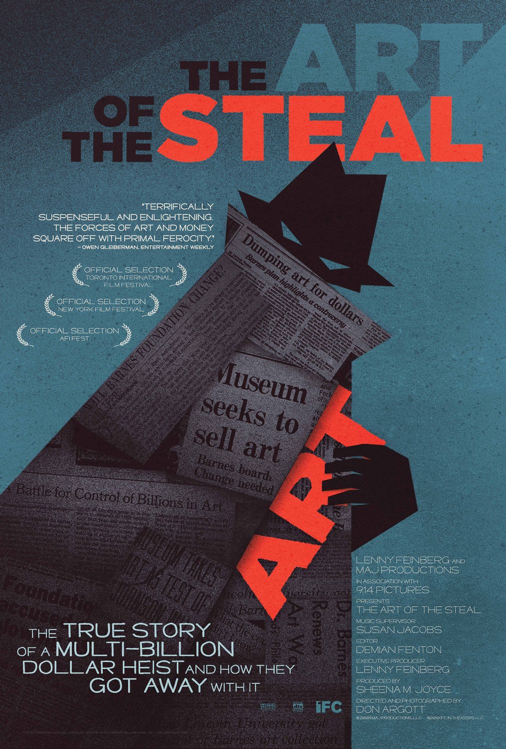 In many ways, though, it is the evolution which is much more interesting, particularly if it gives you a chance to see what might have been. Recently, for instance, there was a wonderful article on how the design of the La Cage Aux Folles poster for the Broadway revival has changed. This week I was watching The Art Of The Steal, a tremendous film on the Barnes Foundation. Regardless of the merits of the film, however, what really caught my eye was the film poster, a marvellous blend of turquoise, strong shapes, typography in relief and highlight colours.
  But the design was not always this way. Indeed, because the film actually came from Frank Abagnale's book, there are a lot of designs kicking about. All try to focus on slightly different elements of the story, in an attempt to cater to a different market. Take a look and see how much difference choice of colours, typography and layout can make!
Monday, 5 April 2010
The Evolution Of Design
Subscribe to:
Post Comments (Atom)


No comments:
Post a Comment